Typography is an often overlooked yet critical component of brand identity. The way text is designed and presented can significantly influence a brand's perception, from first impressions to long-term recognition. In today’s digital age, where consumers are constantly bombarded with information, mastering the art of typography can offer brands a distinctive edge, ensuring they not only capture attention but also build a lasting connection with their audience.
At its core, typography is about visual communication. It's the craft of arranging type to make written language not only legible but also visually appealing and emotionally resonant. In branding, effective typography contributes to both form and function, blending aesthetic appeal with clear messaging. By strategically selecting fonts, sizes, and layouts, brands can express their personality, ethos, and values long before a single word is read.
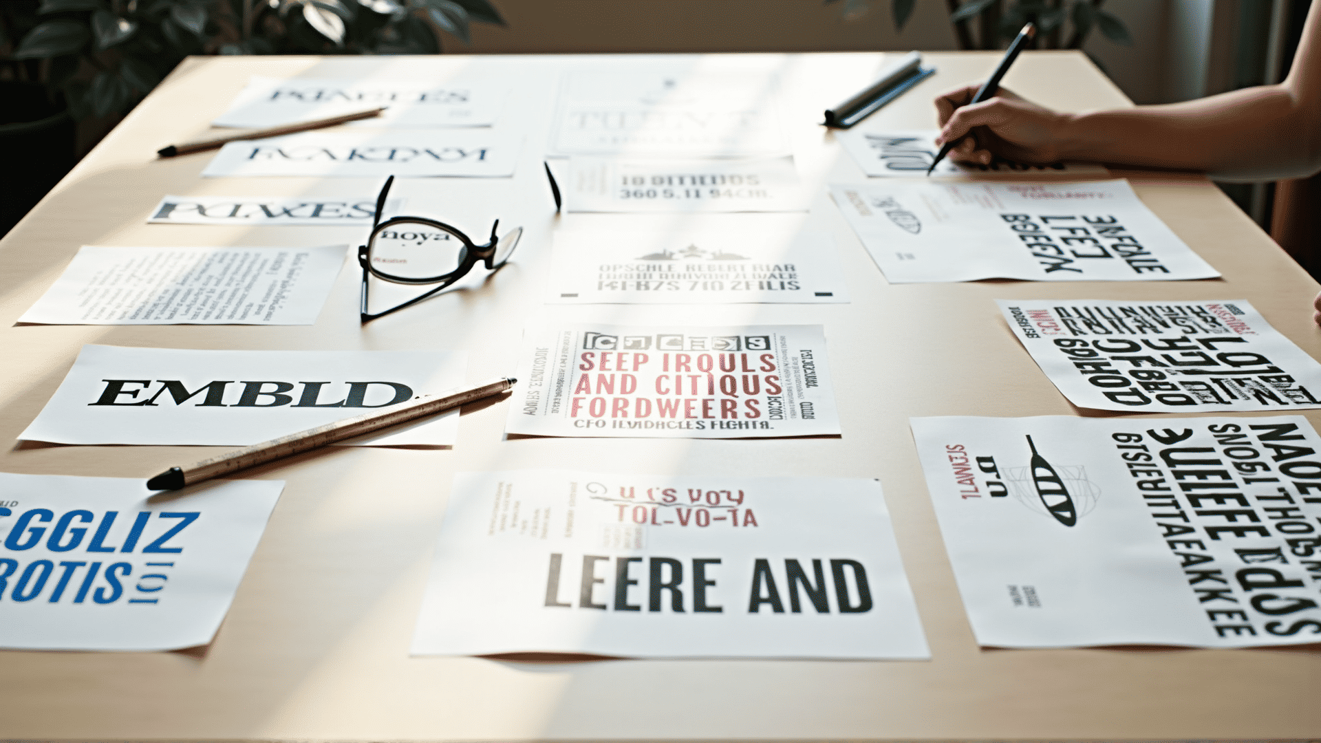
The first step to mastering typography for branding is understanding the emotional and cultural connotations associated with various typefaces. Serif fonts, for example, are often perceived as traditional and authoritative, making them suitable for brands that wish to convey reliability and heritage. On the other hand, sans-serif fonts are seen as modern and minimalistic, appealing to brands that want to project a contemporary and approachable image.
Beyond choosing the right typeface, hierarchy and scale play crucial roles in effective typography. Type hierarchy guides the reader’s eye, directing attention to key messages and information. By varying font sizes, weights, and styles, brands can create a visual path that enhances readability and engagement. A headline with a bold, large typeface can grab attention, while smaller, lighter fonts can ensure detail-oriented content is both accessible and digestible.
Spacing is another essential element. Adequate spacing between letters (kerning), lines (leading), and blocks of text ensures clarity and prevents visual clutter. In digital interfaces, responsive typography is vital. As screens vary in size and orientation, adaptable type scales and layouts ensure consistency across devices, maintaining the integrity of the brand experience whether viewed on a smartphone or a desktop computer.
Color, too, is an integral part of typography. It can set the mood, highlight important elements, and align with a brand’s overall color scheme. However, it’s crucial to maintain readability by ensuring there is sufficient contrast between text and background. Poor color choices can lead to legibility issues, detracting from the message and diminishing the brand's credibility.
Incorporating typography into a cohesive brand strategy involves balancing creativity with coherence. Every typographic decision should align with the brand's voice and visual identity, fostering a seamless experience across all touchpoints, from websites and social media to packaging and print media. Consistent use of typography helps in building brand recognition, as consumers begin to associate specific typefaces and styles with the brand itself.
To effectively harness the power of typography, designers must stay attuned to emerging trends and technologies. Variable fonts, which allow for dynamic adjustments in weight, width, and other attributes, offer unprecedented flexibility in digital typography. Integrating these advancements can lead to more customized and engaging user experiences, setting a brand apart in a crowded marketplace.
Ultimately, mastering typography is an ongoing journey of experimentation and refinement. It requires a deep understanding of both the technical and artistic aspects of type, as well as a commitment to consistently applying these principles to enhance brand communication. As the digital landscape continues to evolve, so too will the opportunities for brands to create impactful identities through thoughtfully crafted typography, ensuring they remain memorable and influential in the minds of their audiences.